The Yin-Yang Symbol: More Than Just a Pretty Circle
5 min reading time
5 min reading time
I remember the first time I really looked at a yin-yang symbol. I mean, really looked at it. I was maybe twelve, staring at a poster in my friend's room. That simple circle with the swirling black and white halves stopped me cold. Something about it felt true in a way I couldn't explain.
The yin-yang symbol has been around for thousands of years. It comes from China, born out of Taoist thinking about how the world works. But here's what gets me: this ancient design shows up everywhere now. On T-shirts. In logos. Tattooed on shoulders and ankles. We see it so much that we almost forget to see it at all.
That bothers me a little. Because this symbol deserves our attention.
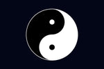
The circle shows two forces that seem opposite but actually need each other. The black side is yin. The white side is yang. Dark and light. Soft and hard. Cold and warm. Female and male. Rest and action.
But look closer. See those dots? The white dot in the black half and the black dot in the white half? That's the part that made my twelve-year-old brain spin. Each side holds a seed of its opposite. Nothing is ever pure. Nothing is ever complete without the other.
The curved line between them flows like water. Not a sharp border. Not a wall. The symbol tells us that these forces dance together. They blend into each other.
I think about this a lot when things feel hard. When life seems all one way or another.
Artists have played with this symbol for ages. In old Chinese paintings, you'll find it tucked into corners. Sometimes it sits at the center of temple ceilings. Other times it hides in the folds of robes worn by wise men in scrolls.
The symbol changed as it moved through time and space. Japanese artists added their own touch. Korean painters gave it new meaning. Each culture that picked it up held it differently.
Modern artists went wild with it. I've seen versions made from fire and ice in photos. Digital artists twist it into shapes that shouldn't work but do. Street artists spray-paint huge versions on brick walls. The basic form stays the same, but the feelings shift.
Some artists make it rough and broken. Others polish it until it gleams. I saw one made entirely from recycled ocean trash once. The message hit different that way. Balance and destruction living in the same image.
Walk through any mall and count how many yin-yang symbols you see. I tried this once. I lost count at forty.
It's on phone cases and coffee mugs. Bumper stickers and throw pillows. The symbol became trendy in the West during the 1960s and 70s. People looking for meaning grabbed onto it. Sometimes I wonder if they knew what they were holding.
Musicians put it on album covers. Fashion designers work it into patterns. Video game characters wear it as patches or pendants. It shows up in movies when someone needs to look wise or centered or mysterious.
But does all this use cheapen it? I go back and forth on this question. Part of me wants to protect the symbol's deep meaning. Another part thinks maybe wide use spreads something valuable. Even if people don't know the full story, maybe the image plants a seed.
Maybe that's the yin and yang of it right there.
The genius of this symbol is how simple it looks. A circle. Two colors. A curve. That's it. A child could draw a basic version.
But try to make a perfect one. The curve has to flow just right. The dots need to sit in exact spots. The balance must feel natural, not forced. It's harder than it seems.
This is why it works so well in design. It scales up or down without losing power. You can make it tiny on a business card or huge on a building. The meaning holds.
Artists love this flexibility. They can honor the traditional form or break it apart. Both choices say something. A perfect, classical yin-yang speaks to order and ancient wisdom. A fractured or reimagined one might talk about modern chaos or personal struggle.
I've seen versions where the colors aren't black and white. Red and blue. Gold and silver. Green and brown. Each color choice shifts the message while keeping the core idea alive.
Those two dots mess with people's heads in the best way. They're small but they carry huge weight.
Think about it. Right when you think you understand the symbol—dark is dark, light is light—those dots show up. They whisper: "Not so fast. Look deeper."
In art, those dots become windows to bigger ideas. Some artists make them glow. Others hide them or make them stand out. A few leave them out completely, though I think that misses the point.
The dots remind us that nothing stays the same. Light carries the seed of darkness. Joy holds the seed of sorrow. Every ending contains a beginning.
When I feel stuck in one mood or one way of seeing things, I picture those dots. They tell me to wait. To look for what's coming next.
I have a small yin-yang pendant. Nothing fancy. I don't wear it every day. But when I pick it up, I feel the weight of all those years of meaning. All those artists and thinkers and regular people who found something true in this shape.
The symbol doesn't solve problems. It doesn't make hard things easy. But it offers a way to hold opposite truths at the same time. We can be strong and weak. Brave and scared. Sure and doubtful.
Art needs symbols like this. We need reminders that life isn't simple. That balance doesn't mean equal. That darkness and light create each other.
The yin-yang symbol keeps showing up because we keep needing what it says. In a world that wants everything sorted into boxes, this circle refuses. It says: flow, blend, accept both sides.
That's worth painting. Worth carving. Worth wearing. Worth remembering.
Even when we see it a thousand times, it still has something to teach us. At least, that's how I feel about it. And maybe that's what makes it real art—not just decoration, but truth we can see.


$30.00


$44.99 - $49.99


$24.99 - $29.99


$44.99 - $47.46